Client: HealthPartners
Project: mySupportCenter
Role: User Experience Designer, Visual Designer
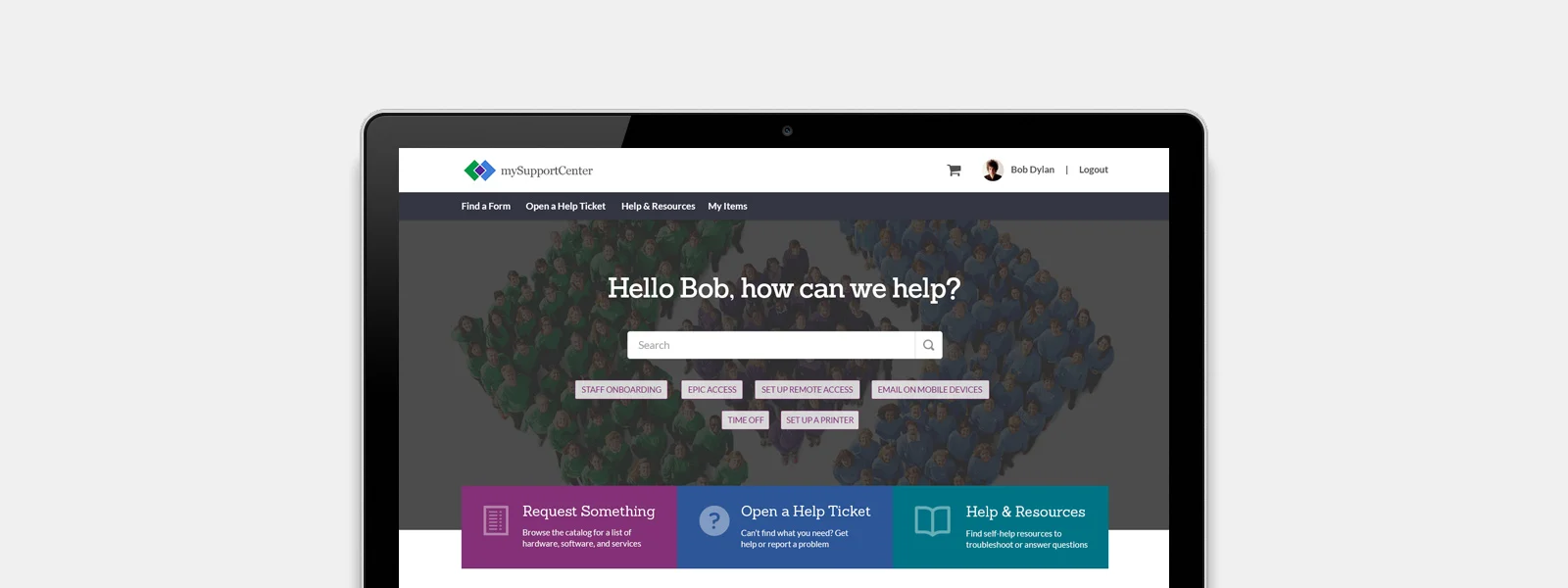
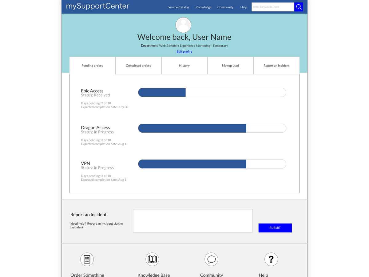
Business Goal: Streamline workflow by making forms easier to find, and reduce calls to Help Desk by showing progress trackers on requests.
Audience: HealthPartners Clinical employees, HealthPartners Corporate employees
User Goals: Allow me to see the status of my submitted requests; Allow me to easily find a form via the search bar; Allow me to access my most frequently used forms.
Description: Based on user feedback, it was clear that My Support Center needed to undergo some major design updates. Along with a re-platforming onto the Service Now platform, we looked at reorganizing the 210 forms into more intuitive categories, as well as surfacing vital status information so that user could check request statuses at a glance.
First, we analyzed the user feedback to distill down our top goals: Form Findability, and Form Usability were the biggest user pain points. Users often couldn't find the form they needed (and often didn't know if the form they filled out was even the correct form), and once a form was filled out and submitted, errors often prevented them from getting processed quickly.
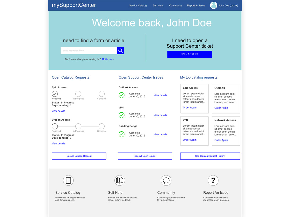
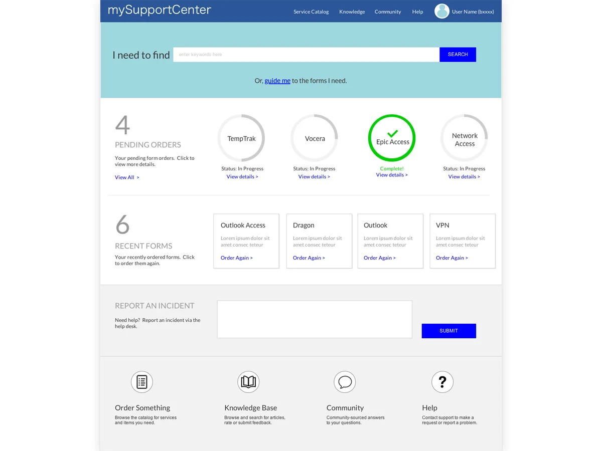
Next we created wireframes and clickable prototypes of several design directions. We conducted preference testing on 2 designs to see which users preferred, and also usability tested each design against top tasks and measured task completion. The results were very clear and helped us decide to surface request status information so users can access it easily.
Finally, we did online surveys to discern what navigation labeling would be most understandable for our users. The results is currently being built and is due to launch end of 2016.
• INFORMATION ARCHITECTURE •
• EXPERIENCE DESIGN •
• VISUAL DESIGN •


